Please click HERE to view my presentation online.
Below are some screenshots of my presentation.
I have finished constructing my film poster for our trailer. Below is my completed film poster:
As I constructed my film poster I also asked for feedback from various people to see what they thought. This feedback gave me very constructive criticism in some areas of my poster - which then allowed me to change and thus improve my poster.
I have presented this feedback using an online presentational tool, Emaze. Please click HERE to view this presentation.
Below is a collage I have made. This shows a few screenshots of my work.
Today I started to plan my film poster. I have saved some images of the Facebook, instagram and twitter logos which I will add to my poster when I make it. I have also started to write the credits that will be included at the bottom of the poster. My group and I felt that we should have the same names for the producers, directors etc. So we made the credits together. Before doing this however, I researched what sort of things should be included in the credits for a film poster. I looked at a few different film posters - but mostly focused on the "Inception" poster. Below is a screenshot of the credits from the inception poster.
I made sure to include things such as, the name of the:
- director
- producer
- executive producer
- writer
- editor
- production company
- actors
- customer designer
Before I wrote out the credits on my word document, however, I researched what the font is for film posters when writing out the credits - as I want my font to be as similar as possible. I found out that the font used is called "Bee Two". I then downloaded a font that was very similar ( as I couldn't find a free version for "Bee Two") and then changed the font to this style of writing on my word document. When I make my poster I will make sure that I use this font.
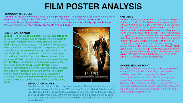
I have made another presentation on the analysis of the film poster, "I Am Legend".
Below are 3 screenshots of my work that I created using the online website, "NewHive"
Or you can click HERE and HERE to view my work from the website.
I have made another presentation on the analysis of the film poster, "Harry Potter and the Deathly Hallows Part 2".
Below are 2 screenshots of my work that I created using the online website, "NewHive"
Or you can click HERE and HERE to view my work from the website.
Today I have made a presentation on the analysis of the film poster, "The Martian".
Below are 3 screenshots of my work that I created using the online website, "NewHive"
Or you can click HERE, HERE and HERE to view my work from the website.


Excellent level of research and planning evidenced. Excellent layout and graphical choices in the poster. With its distinctive font, this makes a memorable product in which the colours, central image and background layer make it convincing and professional.Feedback: the name(s) of the principal actor(s)
ReplyDeletedo not appear, although this is a genre convention. You should add this convention.
I have now changed my film poster to include the name of Marcus just above my credits
ReplyDelete
ReplyDeleteFILM POSTER (individual) Excellent level of research and planning evidenced in Piktochart detailing creative decisions (incl. interesting research & deliberations on layout conventions), deconstruction of codes and conevntions. Very solid detailed background analysis & research into poster genre (presented in NewHive). Excellent layout and graphical choices in the poster. With its distinctive font, created by you in Photoshop by breaking up letters, this makes a memorable product in which the colours, central image and background layer make it convincing & professional. Genre conventions observed (tagline 'The time is now', billing block, 'coming soon', social media, film website). The poster signals its genre well, is visually arresting & works coherently as part of the package.